Introduction
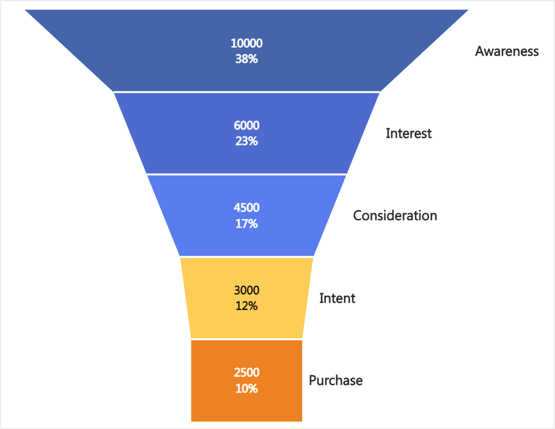
The Powerviz Funnel chart is a powerful visual that allows users to track and analyze the progression of data through various stages of a process. Funnel charts serve as valuable tools for comprehending sequential processes like sales pipelines, marketing campaigns, or website visitor flow.
Powerviz Funnel chart is a Power BI custom visual available at AppSource.
A funnel chart works best when the initial stage is the largest (100%), with each subsequent stage decreasing proportionately. The bar's height in a funnel chart represents the value it holds.
This documentation will help you get started with the Funnel chart by explaining everything you need to know about it. If you're new to our site, check out the visual library for other visuals that meet your requirements.
Powerviz Funnel chart highlights include:
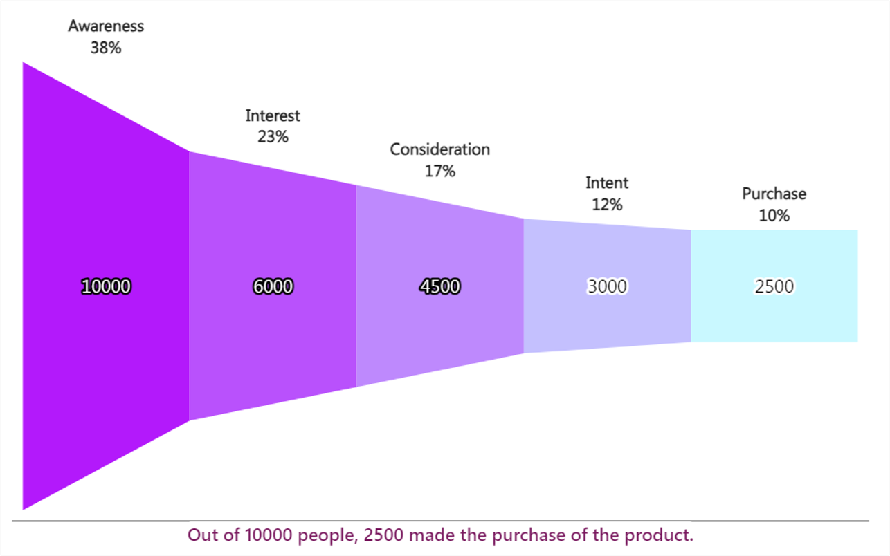
Customize the funnel chart into different
orientationsandfunnel types.Select colors from
7 schemesand30+ palettes.Use them
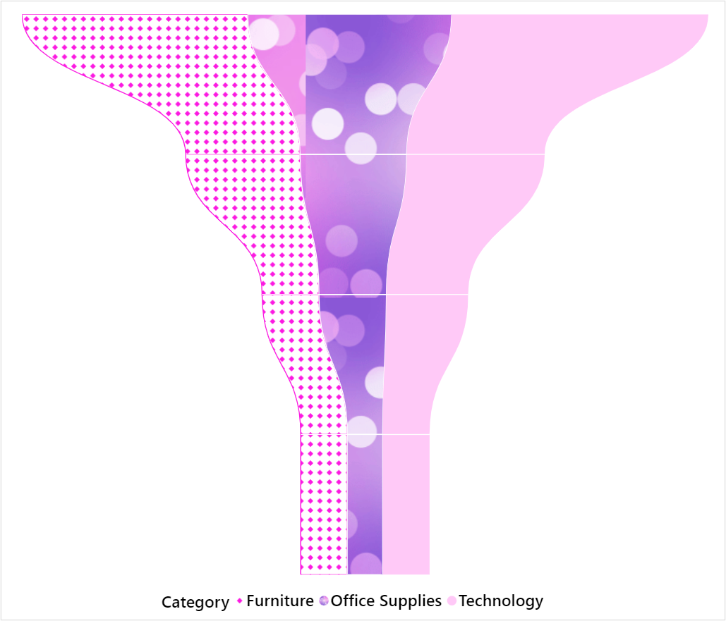
fill patternto customize the stages in the chart.Control over the
labelsinside and outside.Conditional formattingandrankingare supported.In one step add
conversion rateandtotal.Additional features include
grid view,annotation, andshow condition.
Follow this guide to have an in-depth view of the Powerviz Funnel chart. To know more about other Powerviz visuals and slicers, visit our library or contact us directly for a demo.
Examples


Last updated