
Introduction
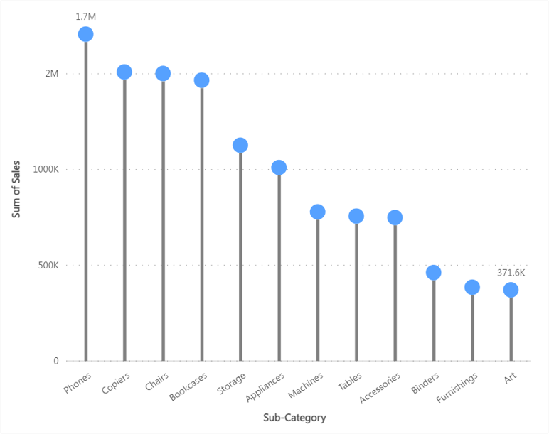
The Powerviz Lollipop chart is an advanced visual that is a bar chart where the bar is transformed into a line and a dot. This chart effectively illustrates the connection between numerical and categorical variables or depicts trends over time.
It is available for download on AppSource & directly from the website. The Powerviz advanced Lollipop chart includes vertical and horizontal styles, IBCS templates, small multiples, race charts, a preview slider, a cut/clip axis, an error bar, dynamic deviation, reference line/band, etc.
This documentation will help you get started with the Lollipop Chart by explaining everything you need to know about it. If you're new to our site, check out the visual library for other visuals that meet your requirements.
Powerviz Lollipop Chart highlights include:
Chart style: Choose between
horizontalandverticalcharts.Select from a variety of
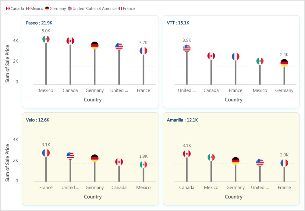
marker stylesavailable or upload your own for a personal touch.Divide your data into smaller visuals using
Small Multiple.Customize the maker using
images,icons, anduploadyour image.Visualize changes in trend over time just in one click using
Race Chart.Mark a single data point or range using
Reference Line/Band.Choose from
30+color palettes.Highlight marker, line, and data labels using
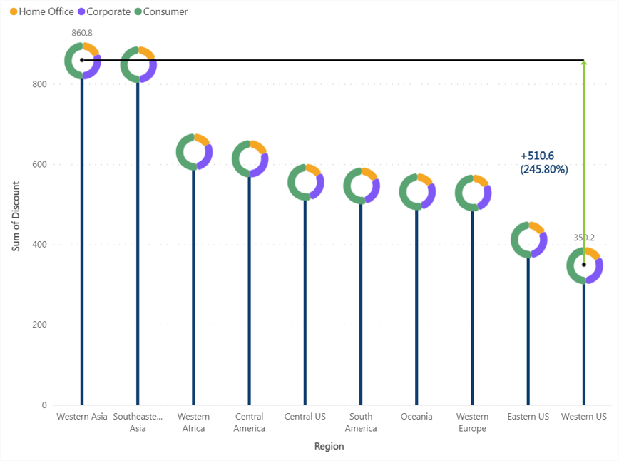
Conditional Formatting.Analyze the deviation between two categories using
Dynamic Deviation.Control the data by applying
filter,sorting, andranking.Select from professionally created
TemplatesandIBCStemplates.Other features include
fill patterns,error bar,preview slider,grid line,annotation, andgrid view.
Follow this guide to have an in-depth view of the Powerviz Lollipop Chart. To know more about other Powerviz visuals and slicers, visit our library or contact us directly for a demo.
Examples
Last updated