> For the complete documentation index, see [llms.txt](https://docs.powerviz.ai/powerviz/llms.txt). Markdown versions of documentation pages are available by appending `.md` to page URLs; this page is available as [Markdown](https://docs.powerviz.ai/powerviz/date-picker/advanced-settings-introduction/calendar.md).
# Calendar
The calendar feature controls all the options that impact the view and interaction of the date picker. It includes the following options:
### Display Mode:[](https://docs.powerviz.ai/datepicker/advanced-settings/calendar#display-mode)
The Powerviz Date Picker offers two views:
#### Popup[](https://docs.powerviz.ai/datepicker/advanced-settings/calendar#popup)
This style shows a single button on the screen. When the button is clicked, a full-screen calendar pop-up opens. Make your date selection and click the apply or clear button to save the changes. Use this option to optimize screen space without compromising on quality.
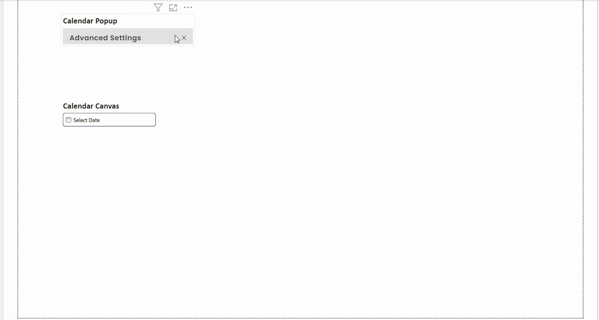
#### Canvas[](https://docs.powerviz.ai/datepicker/advanced-settings/calendar#canvas)
In this view, the calendar is always visible on the canvas. If the canvas area is smaller than the date picker, a scroll bar will appear.
To always have the calendar open, select the **"Keep canvas display all the time"** checkbox. The [date picker button](/powerviz/date-picker/advanced-settings-introduction/date-picker-button.md) will be hidden in this scenario, and instead, filters will be applied and removed directly by the Apply and Clear buttons.
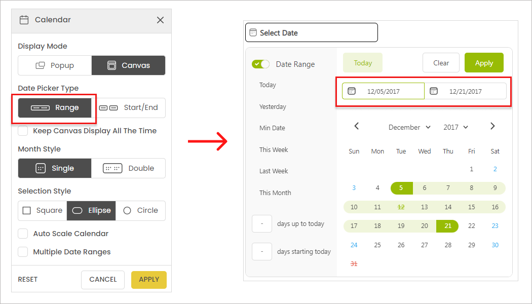
### Date Picker Type[](https://docs.powerviz.ai/datepicker/advanced-settings/calendar#date-picker-type)
Powerviz offers two different types of date picker, each catering to specific business use cases. Here is an overview of the key differences and features of each type:
#### Range[](https://docs.powerviz.ai/datepicker/advanced-settings/calendar#range)
The range is the default option with a single button. It provides a full calendar view and offers the following features:
* Single and multiple date selection.
* Single and multiple date range selection.
* Presets panel.
* Days up to and starting from today input box for a quick date range.
* Different month styles: single and double.
* Always displayed on the canvas.
{% hint style="info" %} INFO
However, this style has some limitations. Users cannot enable presets, select multiple dates, or access an on-screen calendar view.
{% endhint %}
Check out the video to see how start/end and range works.
### Month Style[](https://docs.powerviz.ai/datepicker/advanced-settings/calendar#month-style)
Choose between a one-month or two-month calendar view for your date picker. This allows you to customize the number of months displayed on the screen.
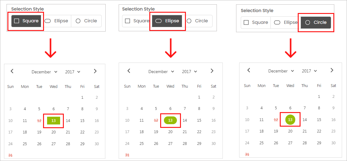
### Selection Style[](https://docs.powerviz.ai/datepicker/advanced-settings/calendar#selection-style)
Personalize the appearance of the selected date button with three shape options: **Ellipse, Circle, and Square**. See image examples for visual reference.
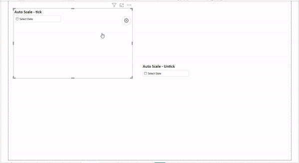
### Auto Scale[](https://docs.powerviz.ai/datepicker/advanced-settings/calendar#auto-scale)
Ensure a perfect fit between the calendar and the canvas area, regardless of the font size. By default, this option is disabled. Enable it to avoid sizing issues and ensure your date picker seamlessly integrates with the canvas. Say goodbye to scroll bars and enjoy a hassle-free experience.
### Multiple Date Ranges:[](https://docs.powerviz.ai/datepicker/advanced-settings/calendar#multiple-date-ranges)
With this feature enabled, you can select multiple date ranges across the calendar. Simply click on the "+" icon on the calendar screen to add additional ranges.
{% hint style="info" %} NOTE
Please note that this option is only available when a date range is enabled. You can select up to **six date ranges**. To select more, create a custom preset using DAX.
{% endhint %}