Powerviz
  • Introduction
  • Installation Guide
    • Install from Appsource
    • Import through file
    • Adding the Powerviz visuals as Organization visuals
  • Date Picker
    • Introduction
    • Get Started
    • Format Pane
    • Advanced Settings: Introduction
      • Calendar
      • Formatting
      • Date Picker Button
      • Default Selection
      • Date Selector
      • Presets
      • Selection Controls
      • Date Range
      • Invalid Dates
      • Weekends/Holidays
    • Themes
      • Default Theme
      • Custom Theme
  • Sunburst
    • Introduction
    • Get Started
    • Format Pane
    • Advanced Settings: Introduction
      • Chart Options
      • Data Colors
      • Fill Patterns
      • Arc Settings
      • Labels
      • Sorting
      • Ranking
      • Center Circle
      • Leaf Label Images
      • Conditional Formatting
      • Show Condition
      • Annotations
      • Grid View
    • FAQ
  • KPI
    • Introduction
    • Get Started
    • Format Pane
    • Edit Mode - Introduction
      • KPI Charts
        • Advanced Text
        • Bar Chart
        • Lollipop Chart
        • Line Chart
        • Area Chart
        • Combo Chart
        • Donut Chart
        • Pie Chart
        • Linear Gauge
        • Liquid Gauge
        • Radial Gauge
        • Bullet Chart
        • Waterfall Chart
        • Icon
        • Image
        • Shape
      • Templates
      • Small Multiples
      • Actions
      • Import/Export
  • Activity Gauge
    • Introduction
    • Get Started
    • Format Pane
    • Advance settings: Introduction
      • Gauge Options
      • Target
      • Data Colors
      • Fill Patterns
      • Labels
      • Ranking
      • Sorting
      • Center Circle
      • Mouse Over Text
      • Conditional Formatting
      • Show Condition
      • Grid View
      • Annotations
  • Funnel Chart
    • Introduction
  • Horizon Chart
    • Introduction
  • Ridgeline Plot
    • Introduction
  • Rose/ Donut/Pie Chart
    • Introduction
  • Word Cloud
    • Introduction
    • Get Started
    • Format Pane
    • Advanced Settings: Introduction
      • Word Options
      • Data Colors
      • Shapes
      • Text Style
      • Direction
      • Ranking
      • Exclude
      • Conditional Formatting
      • Show Condition
      • Grid View
      • Lasso and Reverse Lasso
  • Linear Gauge
    • Introduction
  • Filter
    • Introduction
    • Get Started
    • Format Pane
    • Advanced Settings - Introduction
      • Filter Settings
      • Cell Style
      • Cell Colors
      • Title Bar
      • Column Headers
      • Image Styling
      • Default Selection
      • Conditional Formatting
      • Import/Export
      • Templates
  • Lollipop Chart
    • Introduction
  • Heatmap
    • Introduction
    • Get Started
    • Format Pane
    • Advanced Settings: Introduction
      • Shapes
      • Data Colors
      • Data Labels
      • Axis Settings
      • Grid Lines
      • Sorting
      • Plot Area
      • Reference Lines
      • Ranking
      • Totals
      • Small Multiples
      • Conditional Formatting
      • Show Condition
      • Grid view
      • Lasso and Reverse Lasso
  • Network Graph
    • Introduction
  • Sankey Chart
    • Introduction
Powered by GitBook
On this page
  • Button Label​
  • Date Format​
  • Icons​
  1. Date Picker
  2. Advanced Settings: Introduction

Date Picker Button

PreviousFormattingNextDefault Selection

Last updated 12 months ago

The Date Picker Button is the main button that remains visible on the canvas area. Users can click on this button to open the calendar and select dates. It is placed in the top-left corner. By default, the date picker button remains collapsed and can be expanded by clicking.

NOTE

Please note that this button is not available when the "Canvas displays all the time" checkbox is selected.

Below are the formatting options available for the Date Picker Button:

Button Label

  • Customize the label text displayed on the button.

  • Adjust the width and height of the button.

  • Set the border and background color of the button.

  • Choose the text color, size, and font style.

  • Apply formatting options such as bold, italic, and underline.

Users have control over the date formatting shown on the button. As this button is not editable, the formatting is controlled with this option. The default date formatting is "MM/DD/YYY." You can choose a formatting style from the dropdown or write a custom date format.

Here is the list of pre-filled options:

This is a list of all the characters that can be used to write custom date formats.

Character
Description
Example

d

Display days in single digits without a 0 in the prefix

1-31

dd

Display the day as a two-digit number with a 0 in the prefix

01-31

ddd

Display the day as a three-digit number with 0 in the prefix

001-031

do

Display the day of the month in ordinal number format

1st-31st

Do

Display the day of the year in ordinal number format

1st-366th

DDD

Display the day of the year in three-digit number

001-366

M

Display the month in single-digit without a 0 in the prefix

1-12

MM

Display the month as a two-digit number with a 0 in the prefix

01-12

MMM

Display the month as abbreviation

Jan-Dec

MMMM

Display the month as a full month name

January-December

Yo

Display the year in ordinal number format

100th-9999th

yy

Display the year as a two-digit number

00-99

yyyy

Display the year as a four-digit number

100-999

q

Display the quarter in single-digit number without a 0 in the prefix

1-4

qq

Display the quarter as a two-digit number with a 0 in the prefix

01-01

qqq

Display the quarter as abbreviation

Q1-Q4

qqqq

Display the quarter as a full quarter name

1st quarter-4th quarter

h

Display the hour in single digit number

12

w

Display the week in single digit number

1-52

wo

Display the week in ordinal number format

1st-52nd

ww

Display the week as a two-digit number with a 0 in the prefix

01-52

c/e

Display the day of the week in single-digit number

1-7

cc/ ee

Display the day of the week as a two-digit number

01-07

ccc/eee

Display the day of the week as an abbreviation

Sun-Sat

cccc/eeee

Display the day of the week as a full name

Sunday-Saturday

P

Display the date in “MM-dd-yyyy” format

01-01-2021-12-31-2021

PP

Display the date in short localized format

Jan 1, 2021-Dec 31, 2021

PPP

Display the date in long localized format

January 1st 2021-December 31st 2021

PPPP

Display the date as long localized format

Friday, January 1st, 2021-Friday, December 31st, 2021
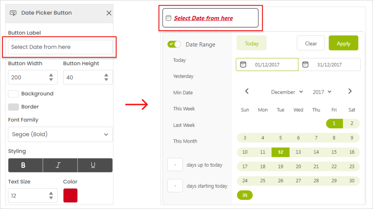
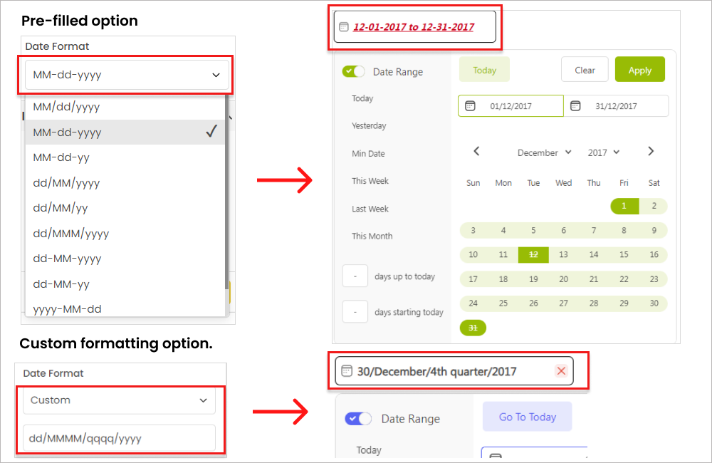
Any symbol

Display any symbol as separator between the day, month, and year

The date picker button includes:

  • Close "❌" icon: which you can use to remove the applied filter. You can easily toggle the icon on and off.

  • Calendar "📅" icon: that appears on date picker.

In the settings, you have the option to customize the:

  • Size,

  • Color, and

  • Radius of the icons.

This allows you to adjust the appearance of the icons to suit your preferences.

Date Format

How to write a custom date format?

Icons

​
​
​
​