> For the complete documentation index, see [llms.txt](https://docs.powerviz.ai/powerviz/llms.txt). Markdown versions of documentation pages are available by appending `.md` to page URLs; this page is available as [Markdown](https://docs.powerviz.ai/powerviz/sunburst/advanced-settings-introduction/annotations.md).
# Annotations
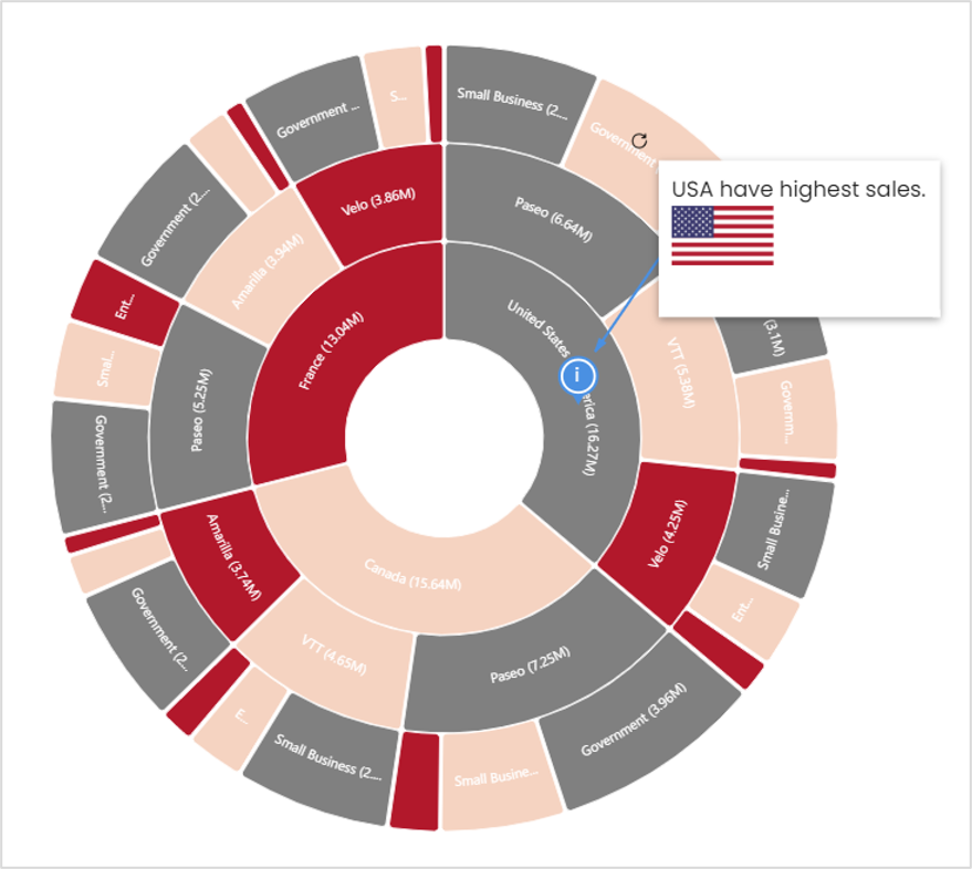
Annotations allow you to add a comment on a specific node. By default, the node is collapsed, and you must hover over the icon to see the comment. In Powerviz annotations, you’ll get multiple options to add a comment. Input types include text, links, images, and dynamic measures. Along with that, you can format each type by color, size, and effect.
### Anatomy[](https://docs.powerviz.ai/sunburst/advanced-settings/annotations#anatomy)
It contains
* `Font styling` : It controls options like text family, color, size, effect, and alignment. Along with this text, it can be converted into bullet points.
* `Insert media` : In annotations, the user can place images, links, and measure in the comment box. The measure is dynamic.
* `Background fill` : Use this to change the canvas background color.
* `Connector styling` : This contains all the color and style formatting for the connector line.
* `Badge styling` : This controls the color and display of the badge.
* `Apply button` : Use the apply button to save the changes.
### Add an annotation on the arc[](https://docs.powerviz.ai/sunburst/advanced-settings/annotations#add-an-annotation-on-the-arc)
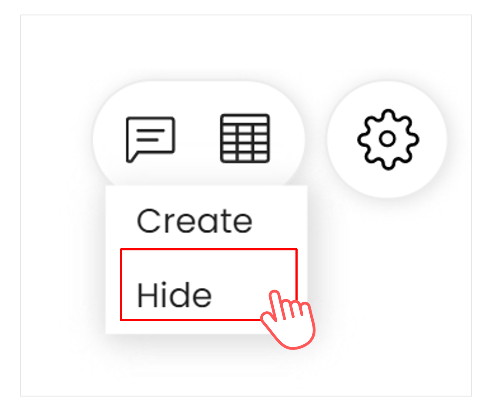
1. Hover over the visual and select the **chat icon** from the top right corner.
2. Annotation has two options: create and hide.
> **Create** lets you add comments, whereas **Hide** lets you hide all the annotations for that session.
3. Click on **Create**. The cursor will act as a selector.
4. Now carefully **select the arc** where you want to place the annotation.
5. Once clicked, the **annotation editor** pop-up will open.
6. **Input** the message, image, link, and measure. Change the formatting as required.
7. Hit **Apply** to save.
### Preview[](https://docs.powerviz.ai/sunburst/advanced-settings/annotations#preview)
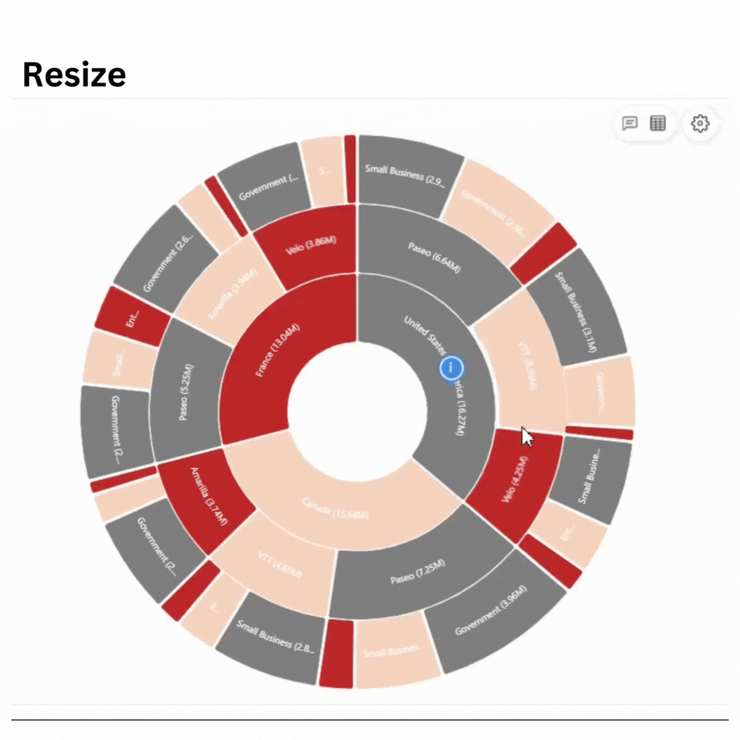
### Tutorial[](https://docs.powerviz.ai/sunburst/advanced-settings/annotations#tutorial)
Watch out for three on-hover annotation options: resize, reposition, and rotate.
{% hint style="danger" %} ATTENTION
Any modifications made in reading mode will not be saved and will return to the default state upon page refresh.
{% endhint %}