Powerviz
  • Introduction
  • Installation Guide
    • Install from Appsource
    • Import through file
    • Adding the Powerviz visuals as Organization visuals
  • Date Picker
    • Introduction
    • Get Started
    • Format Pane
    • Advanced Settings: Introduction
      • Calendar
      • Formatting
      • Date Picker Button
      • Default Selection
      • Date Selector
      • Presets
      • Selection Controls
      • Date Range
      • Invalid Dates
      • Weekends/Holidays
    • Themes
      • Default Theme
      • Custom Theme
  • Sunburst
    • Introduction
    • Get Started
    • Format Pane
    • Advanced Settings: Introduction
      • Chart Options
      • Data Colors
      • Fill Patterns
      • Arc Settings
      • Labels
      • Sorting
      • Ranking
      • Center Circle
      • Leaf Label Images
      • Conditional Formatting
      • Show Condition
      • Annotations
      • Grid View
    • FAQ
  • KPI
    • Introduction
    • Get Started
    • Format Pane
    • Edit Mode - Introduction
      • KPI Charts
        • Advanced Text
        • Bar Chart
        • Lollipop Chart
        • Line Chart
        • Area Chart
        • Combo Chart
        • Donut Chart
        • Pie Chart
        • Linear Gauge
        • Liquid Gauge
        • Radial Gauge
        • Bullet Chart
        • Waterfall Chart
        • Icon
        • Image
        • Shape
      • Templates
      • Small Multiples
      • Actions
      • Import/Export
  • Activity Gauge
    • Introduction
    • Get Started
    • Format Pane
    • Advance settings: Introduction
      • Gauge Options
      • Target
      • Data Colors
      • Fill Patterns
      • Labels
      • Ranking
      • Sorting
      • Center Circle
      • Mouse Over Text
      • Conditional Formatting
      • Show Condition
      • Grid View
      • Annotations
  • Funnel Chart
    • Introduction
  • Horizon Chart
    • Introduction
  • Ridgeline Plot
    • Introduction
  • Rose/ Donut/Pie Chart
    • Introduction
  • Word Cloud
    • Introduction
    • Get Started
    • Format Pane
    • Advanced Settings: Introduction
      • Word Options
      • Data Colors
      • Shapes
      • Text Style
      • Direction
      • Ranking
      • Exclude
      • Conditional Formatting
      • Show Condition
      • Grid View
      • Lasso and Reverse Lasso
  • Linear Gauge
    • Introduction
  • Filter
    • Introduction
    • Get Started
    • Format Pane
    • Advanced Settings - Introduction
      • Filter Settings
      • Cell Style
      • Cell Colors
      • Title Bar
      • Column Headers
      • Image Styling
      • Default Selection
      • Conditional Formatting
      • Import/Export
      • Templates
  • Lollipop Chart
    • Introduction
  • Heatmap
    • Introduction
    • Get Started
    • Format Pane
    • Advanced Settings: Introduction
      • Shapes
      • Data Colors
      • Data Labels
      • Axis Settings
      • Grid Lines
      • Sorting
      • Plot Area
      • Reference Lines
      • Ranking
      • Totals
      • Small Multiples
      • Conditional Formatting
      • Show Condition
      • Grid view
      • Lasso and Reverse Lasso
  • Network Graph
    • Introduction
  • Sankey Chart
    • Introduction
Powered by GitBook
On this page
  1. Date Picker
  2. Advanced Settings: Introduction

Default Selection

PreviousDate Picker ButtonNextDate Selector

Last updated 1 year ago

The default selection feature refers to the date range that is automatically selected when the calendar is first opened or the page is refreshed. This default selection can be set to various time ranges, such as the current day, week, or month. The default selection feature can help control the initial period of data that needs to be selected based on the user's needs and preferences.

You can choose from the commonly used periods from the dropdown or create a custom selection.

Here is the list of commonly used periods:

Name
Description

Max Date

Selects the latest date available in your data.

Max Week

Select the latest week available in your data.

Max Month

Select the latest month available in your data.

Max Year

Select the latest year available in your data.

Today

Select the current date. (Not dependent on the dataset)
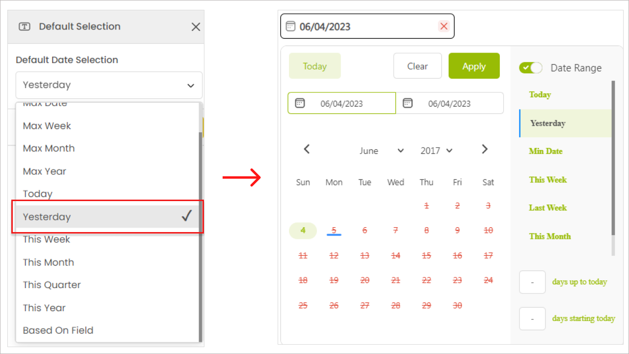
Yesterday

Select the yesterday date. (Not dependent on the dataset)

This Week

Select the current week. (Not dependent on the dataset)

This Month

Select the current month. (Not dependent on the dataset)

This Quarter

Select the current quarter. (Not dependent on the dataset)

This Year

Select the current year. (Not dependent on the dataset)
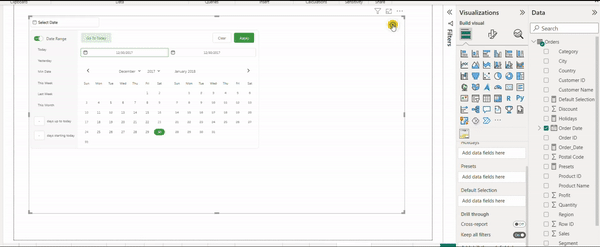
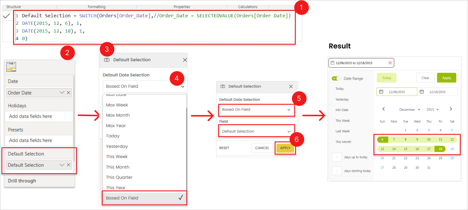
Based on Field

Select any custom period from the data.

To add a custom field as the default selection, follow these steps:

  1. Create a column or measure in your data.

    • Use a 0/1 condition, where 1 represents true and 0 represents false.

    • This column can be created in your source data, Power Query Editor, Calculated Column, or using DAX formula.

DAX Measure Example
VAR _date = MIN('Date'[Date])

VAR Result = 
        IF(_date = BLANK(), BLANK(), 
            SWITCH(TRUE(),
                _date = DATE(2022, 12, 10), 1,  // 1 for true dates
                _date = DATE(2022, 01, 22), 1,
                0)                              // 0 for false dates
        )
    
RETURN
Result 
  1. Drag the custom column into the default selection field.

    • Ensure that the column is of numeric type.

    • If it's a column, choose either MIN or MAX as the aggregation type.

  2. Open the default selection option in the advanced settings.

  3. Select “Based on field” from the dropdown.

  4. Select the custom column.

  5. Hit “Apply” to save.

The default period based on your custom field will now be applied. To test it out, clear any existing filters and refresh the page.

Steps to create custom default selection

Refer to this link for information on .

​
adding a custom column