> For the complete documentation index, see [llms.txt](https://docs.powerviz.ai/powerviz/llms.txt). Markdown versions of documentation pages are available by appending `.md` to page URLs; this page is available as [Markdown](https://docs.powerviz.ai/powerviz/sunburst/advanced-settings-introduction/center-circle.md).
# Center Circle
## Center Circle
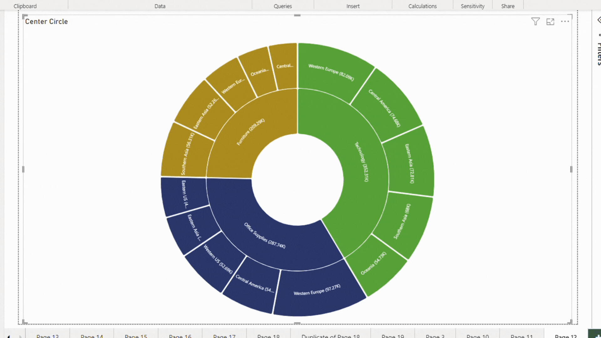
In Powerviz Sunburst, you can customize the center circle area. It helps make the visual more engaging. In this section, we will discuss the different types of layers available in the center circle and how to set them up.
Steps to apply the layer[](https://docs.powerviz.ai/sunburst/advanced-settings/center-circle#steps-to-apply-the-layer)
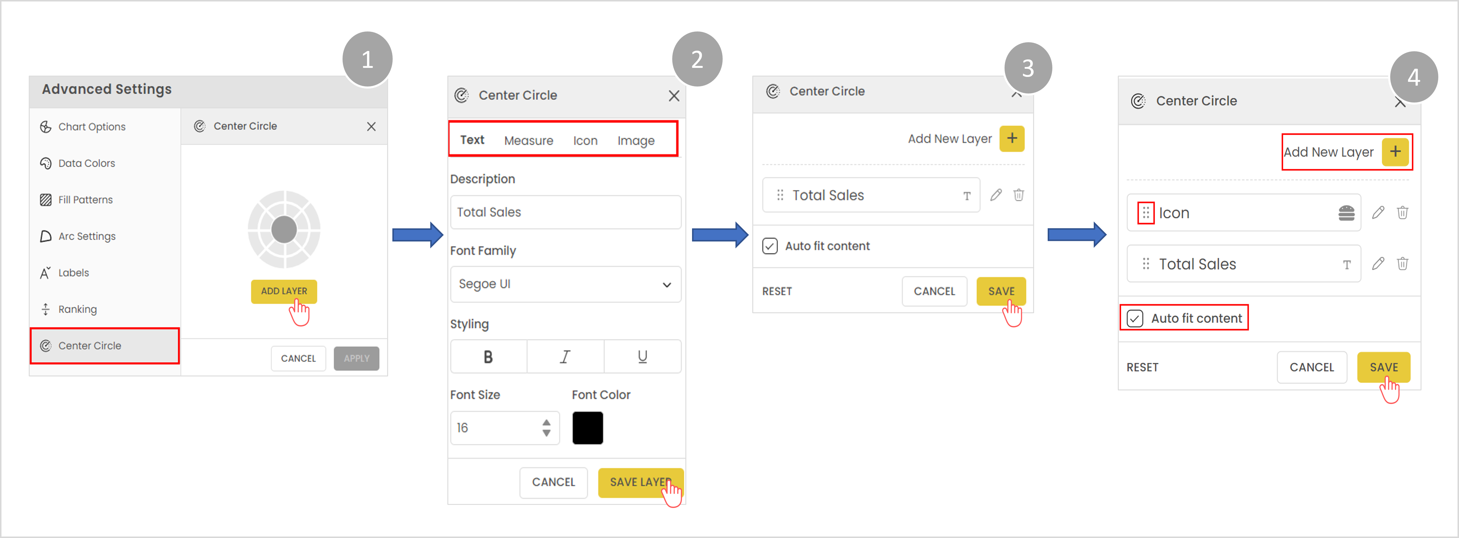
1\. Open the center circle, and click on **Add Layer**.
2\. Choose the layer type. Apply settings, and then select **Save Layer**.
3\. After this, make sure to hit **Apply** to save the changes.
4\. You can add **multiple layers** in the center circle.
5\. Use the 6-dot icon to change the order of layers.
6\. Keep "**Auto fit content**" enabled for the best fit.
gif
#### Types of layers[](https://docs.powerviz.ai/sunburst/advanced-settings/center-circle#types-of-layers)
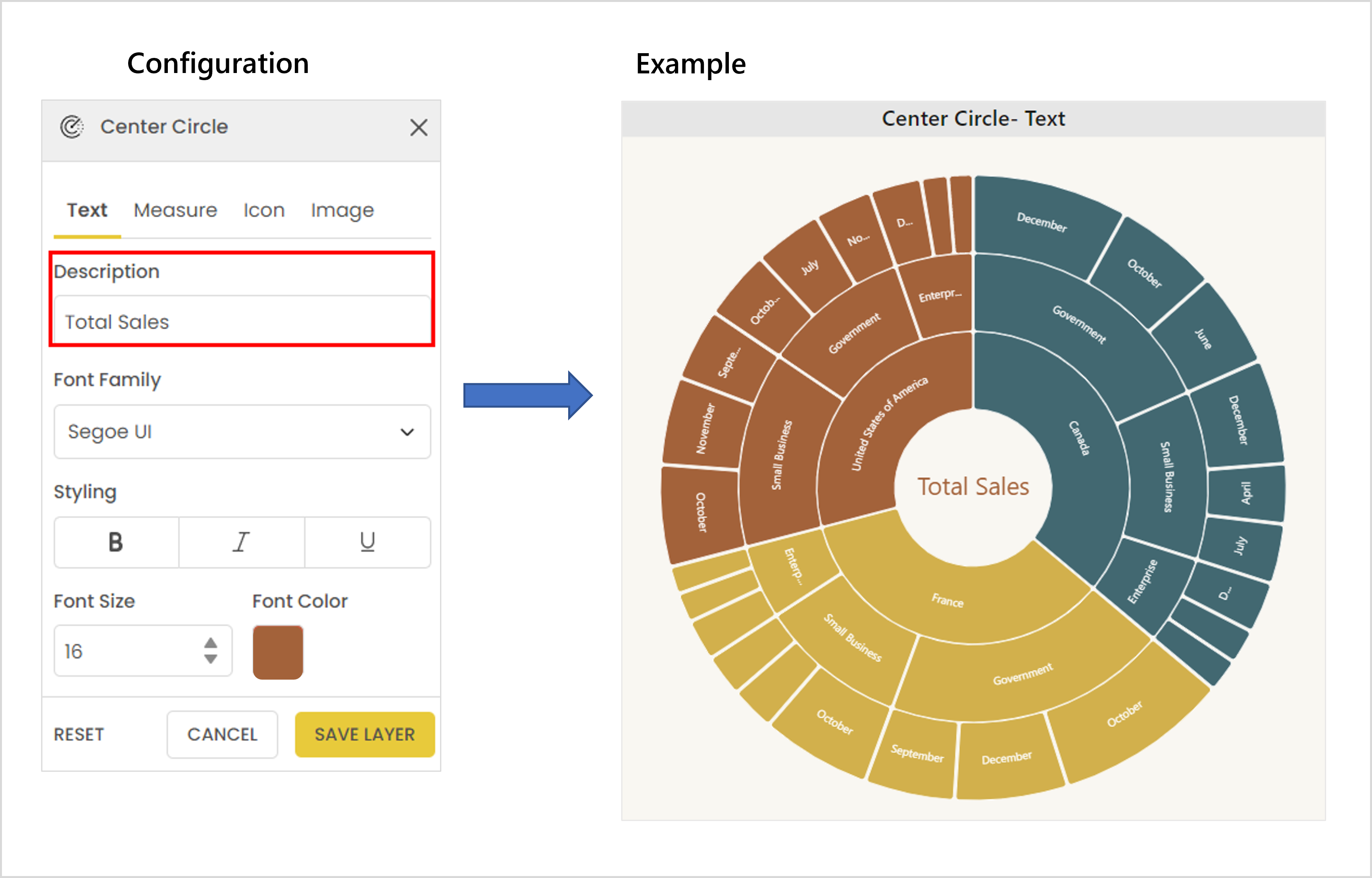
**Text**[****](https://docs.powerviz.ai/sunburst/advanced-settings/center-circle#text)****
Add custom text in the center area. This contains the following features.
| **Feature** | **Functionality** |
| ---------------- | ------------------------------------------- |
| Description | Input text here. |
| Font Formatting | Customize the font family, color, and size. |
| Advanced Styling | Bold, italic, and underline. |
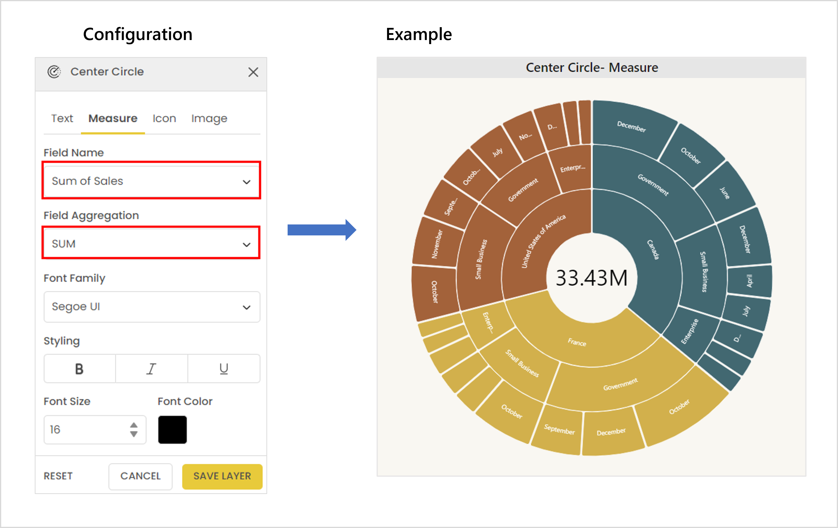
#### Measure[](https://docs.powerviz.ai/sunburst/advanced-settings/center-circle#measure)
The measure allows you to display the measure field value in the center circle.
| **Feature** | **Functionality** |
| ----------------- | ----------------------------------------------------- |
| Field Name | Select the measure here. |
| Field Aggregation | Indicates the aggregation type. It only contains SUM. |
| Font Formatting | Customize the font color, size, and family. |
| Advanced Styling | Bold, italic, and underline. |
{% hint style="info" %}
NOTE
This layer is dynamic and changes with filters
{% endhint %}
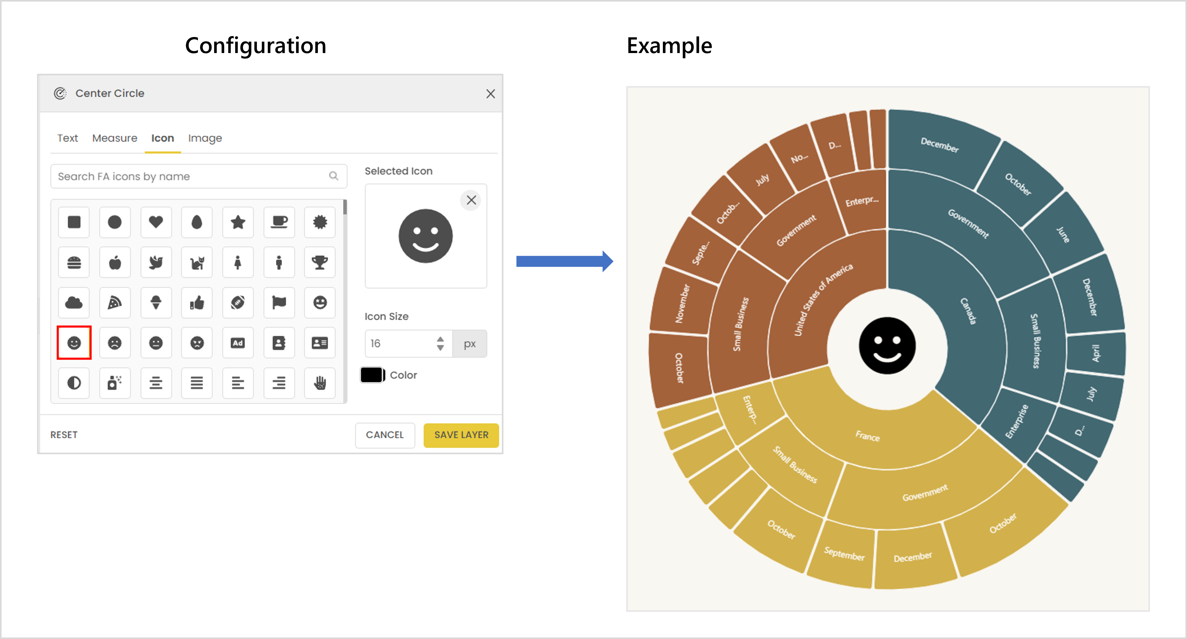
#### Icon[](https://docs.powerviz.ai/sunburst/advanced-settings/center-circle#icon)
Choose icons from 2000+ options. Customize the icons
* Color
* Size
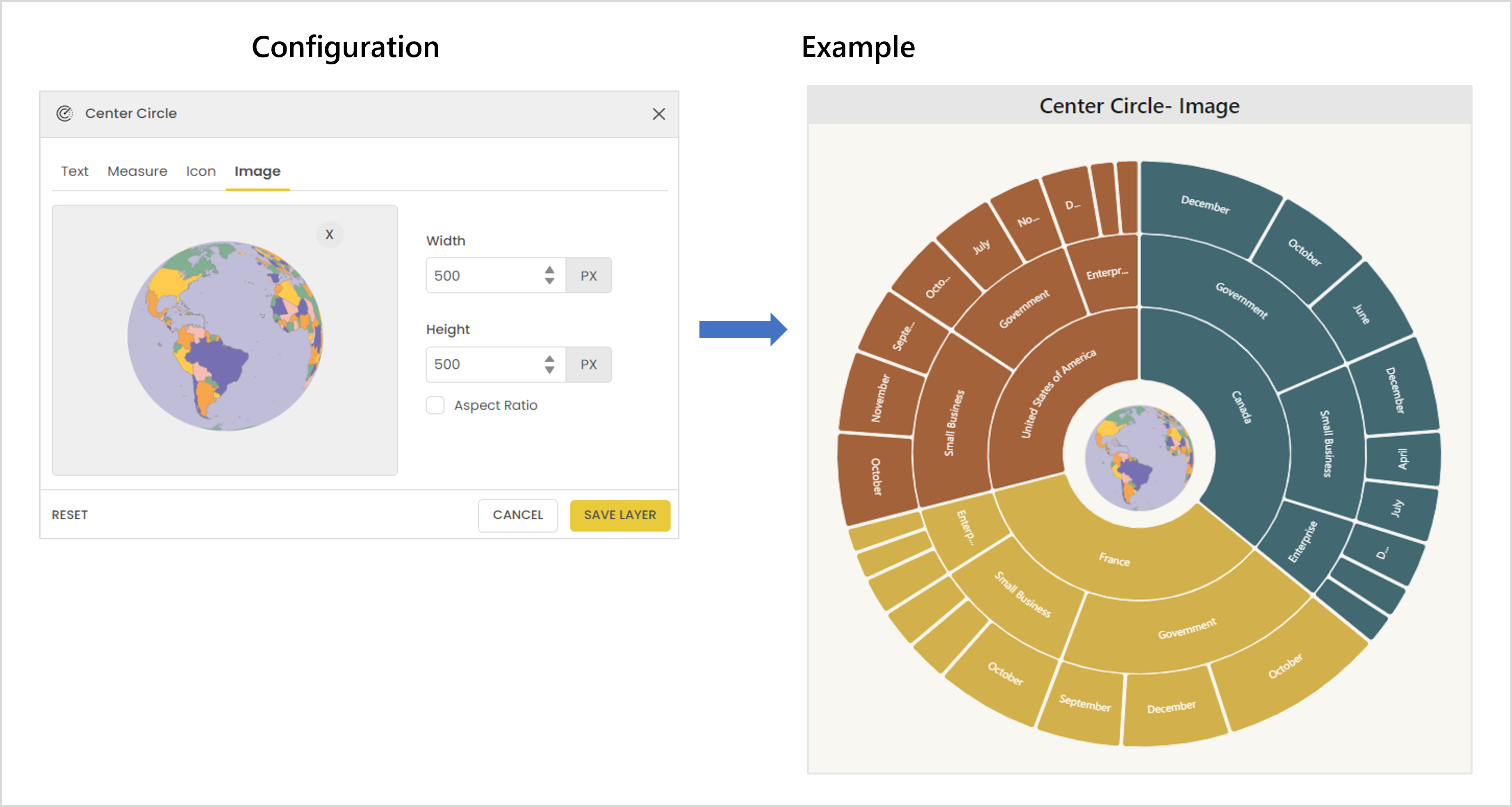
#### Image[](https://docs.powerviz.ai/sunburst/advanced-settings/center-circle#image)
Select a custom image or logo to place in the center circle. You can change the image's height, width, and aspect ratio.
{% hint style="info" %}
INFO
Images only accept PNG, JPG, and GIF formats. The maximum size limit is 5MB.
{% endhint %}
{% hint style="success" %}
Use "**Auto fit content**" to compress all layers into the center circle.
{% endhint %}