> For the complete documentation index, see [llms.txt](https://docs.powerviz.ai/powerviz/llms.txt). Markdown versions of documentation pages are available by appending `.md` to page URLs; this page is available as [Markdown](https://docs.powerviz.ai/powerviz/sunburst/faq.md).
# FAQ
Q: How can I change the number formatting to % format?
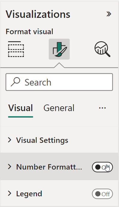
A: By default, Sunburst uses custom number formatting, which does not offer the percentage format. To use the % format, you can **disable the number formatting option** in the visualization pane.
**To use Power BI formatting, disable the "number formatting" from the visualization pane.**
#### Q: How can I change the number formatting to % format?[](https://docs.powerviz.ai/sunburst-faq#q-how-can-i-change-the-number-formatting-to--format)
A: By default, Sunburst uses custom number formatting, which does not offer the percentage format. To use the % format, you can **disable the number formatting option** in the visualization pane.
{% hint style="info" %} INFO
To use Power BI formatting, disable the "number formatting" from the visualization pane.
{% endhint %}
#### Q: How can I enable cross-highlight in the Sunburst?[](https://docs.powerviz.ai/sunburst-faq#q-how-can-i-enable-cross-highlight-in-the-sunburst)
A: By default, the Sunburst has the Zoom option enabled, which allows you to drill down into multiple layers. If you want to use highlighting instead, you can **disable the zoom option** in the advanced settings.
#### Q: Why are the minimum values in the matrix and sunburst views different?[](https://docs.powerviz.ai/sunburst-faq#q-why-are-the-minimum-values-in-the-matrix-and-sunburst-views-different)
A: In the sunburst view, the value is calculated based on MAXX, MINX, and AVERAGEX, which evaluate an expression for each row of the table and return the value. In contrast, in the matrix view, the minimum value is calculated using quick aggregations based on MAX, MIN, and AVERAGE, which returns the value based on the entire column.
*Sunburst Visual only has access to limited data, unlike Power BI visuals, which cannot access entire data and give the same output.*
#### Q: Why are Powerviz Sunburst and Power BI Matrix outputs different when using AVERAGE?[](https://docs.powerviz.ai/sunburst-faq#q-why-are-powerviz-sunburst-and-power-bi-matrix-outputs-different-when-using-average)
A: In Sunburst, the child node values are added to determine the next level, while in matrix view, the average is calculated based on each row's values for the layer.
How Matrix calculates:
```
Average Sale = AVERAGE(Orders[Sales])
or
Average Sale = SUM(Orders[Sale])/COUNTROWS(Order) = 260.
```
How Sunburst calculates:
```
Average Sale for Parent level [Q1] = Sum of Child layer values. [Jan+Feb+Mar]
```
This is done to avoid discrepancies where the total of rows is not equal to 100% in the matrix view. The sunburst adding-up method ensures that the total is always 100%.
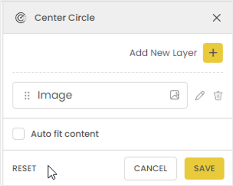
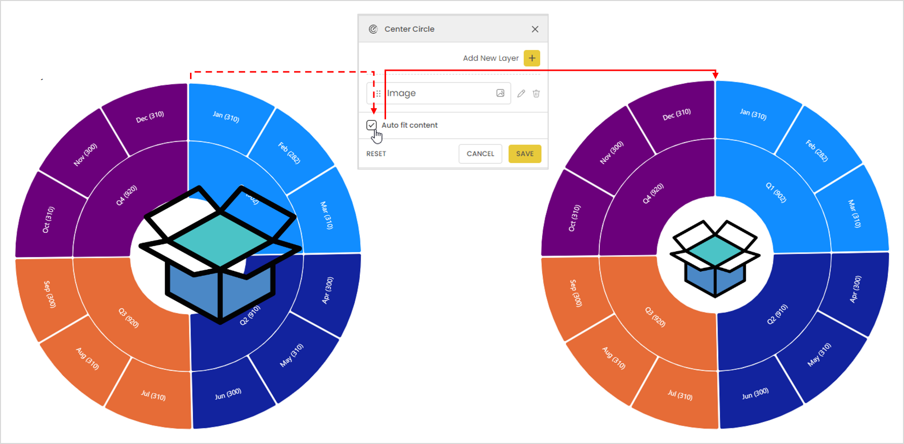
#### Q: Why is the aspect ratio in the center circle not working?[](https://docs.powerviz.ai/sunburst-faq#q-why-is-the-aspect-ratio-in-the-center-circle-not-working)
A: In the Sunburst center circle, "auto-fit content" is enabled to ensure the best fit of all the layers. If the setting exceeds the center circle limit, it compresses the size of the layers. To see the actual settings and aspect ratio, disable this option.
NOTE
Keep in mind that if the input value is higher than the center circle space, the layers will overlap.
#### Q: Why are the center circle values overlapping the visual?[](https://docs.powerviz.ai/sunburst-faq#q-why-are-the-center-circle-values-overlapping-the-visual)
A: If "auto-fit content" is disabled, and the layer size is higher than the center circle area, it will overlap. **Enable "auto-fit size"** for the best fit.
#### Q: Why is there an "others" name node on the screen?[](https://docs.powerviz.ai/sunburst-faq#q-why-is-there-an-others-name-node-on-the-screen)
A: By default, Sunburst ranking shows the top 5 with the remaining values as "others."
#### Q: Why is Sunburst hiding all the negative values from the data?[](https://docs.powerviz.ai/sunburst-faq#q-why-is-sunburst-hiding-all-the-negative-values-from-the-data)
A: Like any other circular form visual, in the case of data with a mix of negative and positive values, Sunburst will only show positive values.
#### Q: How does the Hide option work in annotations?[](https://docs.powerviz.ai/sunburst-faq#q-how-does-the-hide-option-work-in-annotations)
A: Hide is used to temporarily remove all the comments from the screen. They will reappear after refreshing the page. To permanently delete a comment, use the delete option instead.
#### Q: How to use the Show condition?[](https://docs.powerviz.ai/sunburst-faq#q-how-to-use-the-show-condition)
A: Refer to this page to learn more about the [Show condition](https://docs.powerviz.ai/sunburst/advanced-settings/show-condition).
#### Q: Why are images not working in Sunburst?[](https://docs.powerviz.ai/sunburst-faq#q-why-are-images-not-working-in-sunburst)
A: Due to the latest [privileges update](https://learn.microsoft.com/en-us/power-bi/developer/visuals/capabilities#privileges-define-the-special-permissions-that-your-visual-requires) in Power BI, custom visuals cannot use private URLs. To render images, use base64 encoded URLs.
#### Q: Why are the categories repeating within "Others"?[](https://docs.powerviz.ai/sunburst-faq#q-why-are-the-categories-repeating-within-others)
A: In the case of "Others," it clubs all the values apart from the top/bottom N. But from the second layer onward, "Others" clubs value based on 2-level information.
In this example, the 3 **Technologies** represent values from **Saturday, Tuesday and Wednesday**. Hence clubbing makes it hard to verify.
 **To use Power BI formatting, disable the "number formatting" from the visualization pane.**